Duration
2 weeks of a 10 week course
My Role
User Research
Interaction Design
Tools Used
OmniGraffle
Sketch
InVision
Design Brief
In the second week of General Assembly’s UXDI class, we had to design an online shopping experience for one of a number of local businesses. The business I chose was Everyday Music, a local used record store. In this project, we refined our user flow, interviewing, and interface sketching skills, and learned about wireframing, competitive analysis, sitemaps, form design, and usability testing with interactive prototypes.
User Interviews
I interviewed a few people in class, but I also know a number of record collectors. We were given the choice of three different personas to see how we dealt with design constraints. I chose Laura, who’s a bit of a power user, so I decided that interviewing my record collector friends was completely appropriate. My questions mostly revolved around what they liked about shopping in a record store as opposed to shopping online.
From the interviews, I found that shopping online is good for very targeted purchases, like when you want a specific album or song, but that if you’re browsing, or looking for opportunity finds, then physical stores are the way to go. I also learned about Discogs.com, which is aiming to be a comprehensive catalog of all music ever, as well as a marketplace for collectors to buy and sell rare albums. Discogs has largely supplanted eBay as the place to get rare physical media.
Competitive Analysis
The most obvious comparison, if you're selling music online, are the big companies, like Amazon, Apple, and Google, and if you're selling physical media, the obvious competitors to look at are Discogs and eBay, so I did a competitive analysis on those companies.
Competitive Analysis (Google Docs)Online Research
I also decided to just do some googling about why people go to record stores in the first place. I found a decent number of articles that said that record (vinyl) sales are actually increasing, while CD sales are dropping, as well as a number of articles about the strategies that record stores are using to stay in business.
Gizmodo on rising record sales.
Paul T. Bradley of the LA Weekly on the role of brick-and-mortar record stores in music fandom.
Joel Oliphint of Pitchfork on what it takes for a modern record store to survive.
Notable quotes:
"You can go in with a plan and the plan is going to be shattered. You're not going to find what you're looking for — you're going to find something you didn't expect."
"That's a whole different experience than going online," he adds. "There's not much adventure there. There's not much uncertainty."
"Young people started reacting instinctively, realizing they liked the tactile experience of music—I don’t even think it was conscious. They enjoy face-to-face interactions, not downloads from some piece of machinery. It’s better socially, better for the community, and people can feel it."
Second Competitive Analysis
With that in mind, I decided to look at the websites of some local used record stores, Easy Street, Jive Time, and Bop Street. What I found was that out of these three, only Easy Street had any online shopping experience at all, and they simply used a third party product in order to sell MP3s and new music. I called Easy street and asked if they sold any of their used stock online, and it turned out that they had a discogs store for their more valuable used stock. But when I looked at their website, it had no links to their discogs store.
Conclusions
The conclusions I drew from all this is that the target market for record stores is not the same target market served by streaming and music download services. My interpretation was that an online shopping experience for a local record should be aimed towards emphasizing browsing, and making musical connections, as well as emphasizing the condition of the actual physical media involved. The goals of a record store's online site should also be bringing people into the physical store, in order to build community. The first competitive analysis wound up being less useful as a way of sizing up the competition, then as a way of discovering the baseline set of features you might need in order to sell music online.
Wireframes
With the information from user, and online research, I decided on a set of features that I wanted:
Pictures of actual physical media
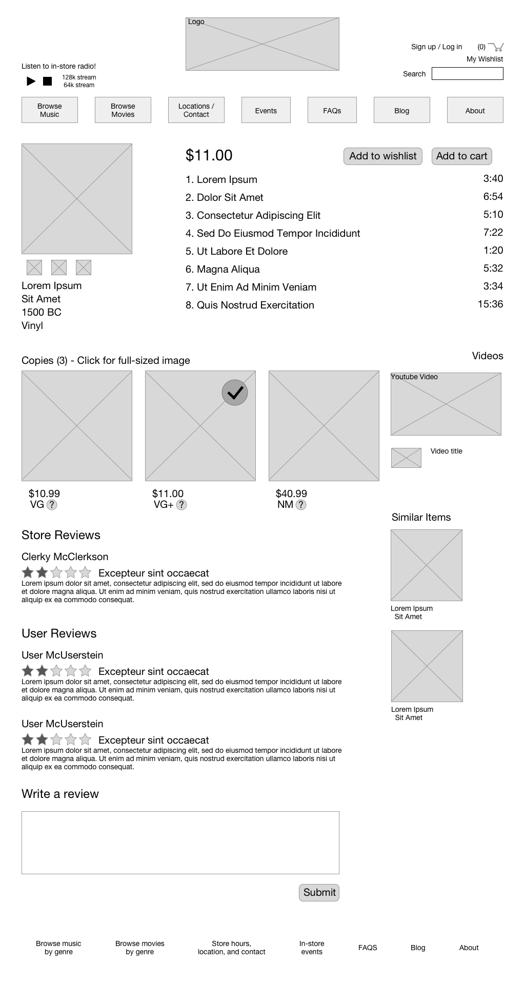 (See this in context)
Links to YouTube videos of music from albums
(See this in context)
Explanation of record grades
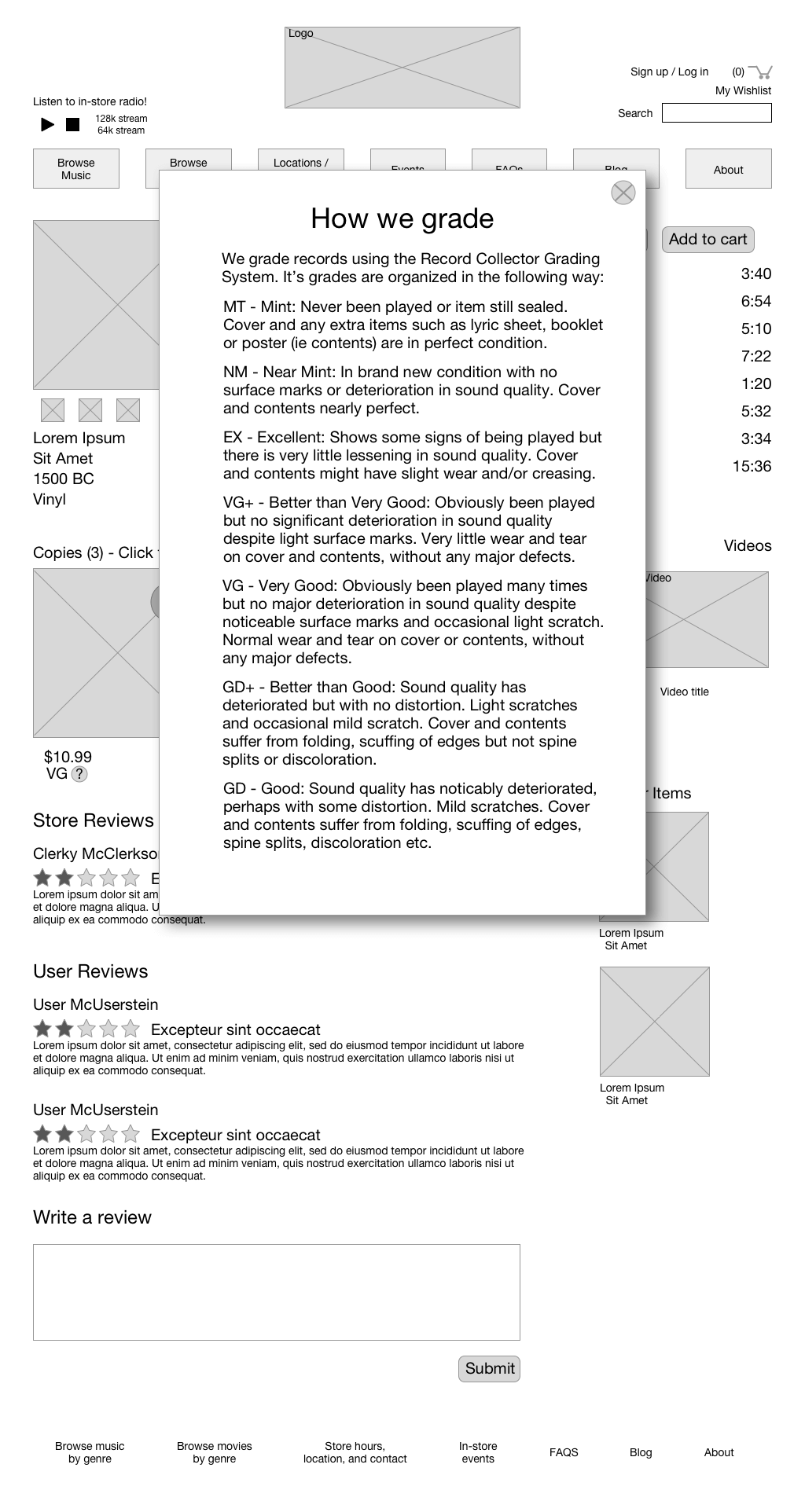 (See this in context)
Related tracks/you might also like
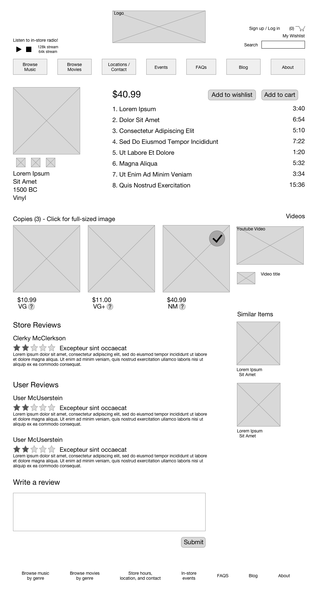 (See this in context)
Driving in-store traffic
Additionally, there were a number of features that I felt could be added in order to get more people into the store itself:
In-store radio
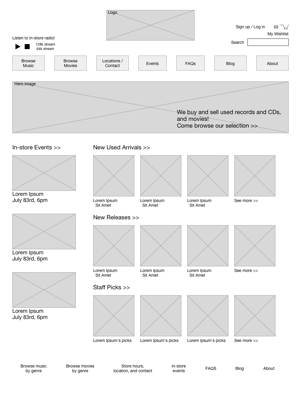 (See this in context)
Staff recommendations/picks
(See this in context)
In-store pickup
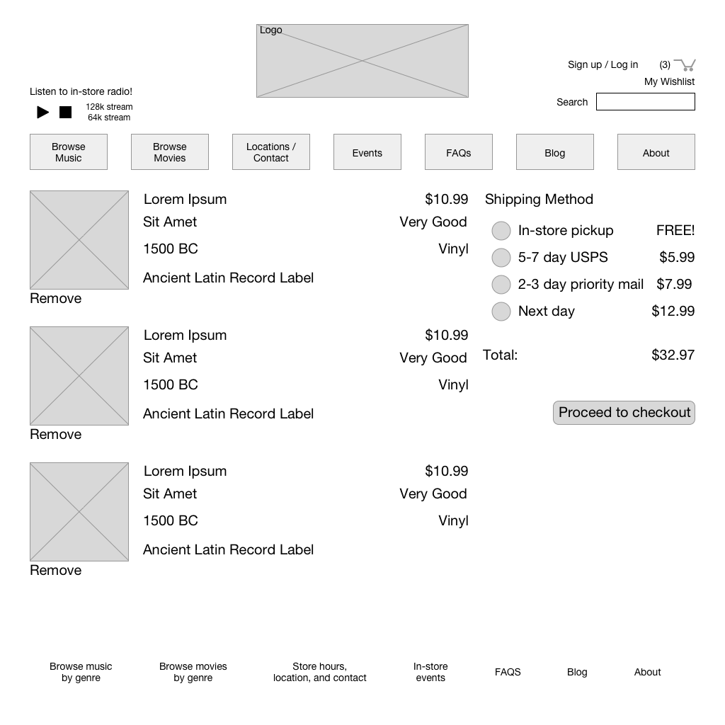 (See this in context)
Design iterations
Online shopping is an area with a lot of precedent by now, so there’s plenty of examples to use for interface design. That said, there’s still some areas that have subtle difficulties, and needed design iterations:
The checkout page started out being very busy. I replicated the entirety of the user’s order at each step, but it turned out that this wasn’t always necessary. The user could see their order in detail on the shipping methods page, but on the shipping address and payment methods page, I changed it to a summary of the costs.
The sign up/log in modal was also a bit of a challenge. It turns out that tabbed interfaces are difficult to get right, and this went through a few redesigns before users were able to use it properly.
Originally, on the home page, I’d designed it so that you saw three browsing categories: Staff picks, newly arrived used records, and new releases. I made sure to test this to see if users understood what each category was, but it turned out that users were primarily interested in newly arrived used stock, so I rearranged the order of the categories to place newly arrived used records first, new releases second, and staff picks last.
I also originally had three examples in each category, but it turned out that users wanted to see as many as they could. I opted for a compromise, increasing the number of thumbnails to four, and linking the category headers to a more detailed category page, where they could see a larger list of records in that category.
Lastly, the way I had originally wanted to set up email alerts, and allow users to discover the functionality, was to display out of stock records in searches. This tested very poorly, and violated some user design principles, so I took that out of the final version.
Next Steps/Metrics
The easy way of measuring success wuld just be to see how much money the online store made, but since the purpose of the redesign is partially to encourage people to come into the physical location, measuring foot traffic would also be an indicator of success. If the physical stores don't already have a people counter of some sort, installing them would provide useful metrics. Additionally, it could track conversion rates in the store itself.
Summary
Designing an online experience for a business whose main draw wound up being a brick and mortar store is an interesting design challenge. An website isn't antithetical to that goal, and an online shopping experience doesn't necessarily have to take away from it. With thought and testing, I feel like local businesses can succeed in a difficult market and differeniate themselves.
Contact
- me@joshsera.com
- linkedin.com/in/joshsera
- ©2017 Joshua Sera, Seattle, WA