Duration
2 weeks of a 10 week course
My Role
Visual Design
Interaction Design
Team
Alyson Dietz
Joshua Sera
Randy Wright
Design Brief
For our third project at General Assembly, we worked as a team to redesign a mobile app, and add a feature of our choosing. We got the AllRecipes mobile app. The AllRecipes app is popular and has opportunity for improvement both through tweaks of the UI as well as the new feature we designed.
Project Challenge
The AllRecipes app provides a way for users to discover new recipes, organize recipes they are familiar with, and create shopping lists for meals they want to prepare. In order to improve the app, and decide on a new feature, we need to know what people's cooking processes are, in order to design a way of making their processes easier.
User Research
We used a combination of an online survey, and in-person interviews to determine how users found new recipes, stored the recipes they liked, and how they dealt with constraints like dietary restrictions. We found that in-person interviews, with open-ended questions yielded the most interesting, and the most useful results. All three of us interviewed users using the following set of questions:
- How experienced a cook do you consider yourself? (beginner, average, next top chef)
- How do you typically find new recipes?
- How do you organize recipes that you like?
- Do you currently use particular recipe websites or apps? Which ones?
- How many people do you cook for? Kids? Adults?
- Are you looking for particular qualities in a recipe site or app? (i.e., reviews, ethnic foods, meal planning, shopping lists, etc.)
- Do you have any dietary restrictions? If so, what are some difficulties you experience when trying to find recipes?
- What do you find difficult about following recipes in general?
We also had our interviewees se the AllRecipes app in order to get an idea of how usable the current app is. The takeaways from this research was:
- Very, very few people currently use an app for storing or following recipes. The most popular method for recording recipes was actually the good, old-fashioned notebook.
- People really disliked having to scroll around while following recipes, specifically, scrolling back and forth between the directions and the list of ingredients was annoying.
- People wanted simplicity in the recipes they looked for.
Additionally, these were the issues we found in the current mobile app:
- The main page of the app was an uncategorized list of recipes. It was a firehose of information, which put people off.
- People generally disliked the shopping list feature, finding it unintuitive, and difficult to edit.
Wireframing
User research gave us an idea of the work we wanted to prioritize. We decided to add a filtering system to the main recipe feed screen, clean up the shopping list feature, and add a voice activated hands-free mode, so people wouldn't have to touch their phones with flour or grease-covered fingers.
Since we ony had two weeks, and designing for both iOS and Android would add significantly to our workload, I decided to focus on Android. This gave me a chance to research Google's Material Design guidelines and apply them to the app.
Ingredient Tooltips
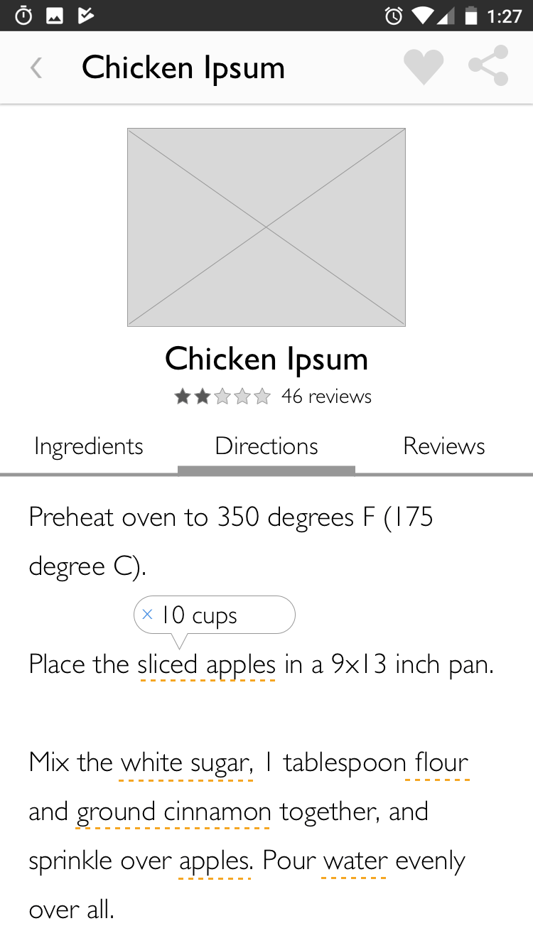
Initially, I had tooltips on ingredients that, when tapped, would let the user know how much of that ingredient was needed in that step, but users wound up getting confused by that, so I took that completely out.
Bottom Navigation
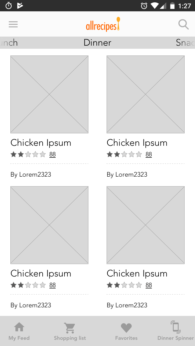
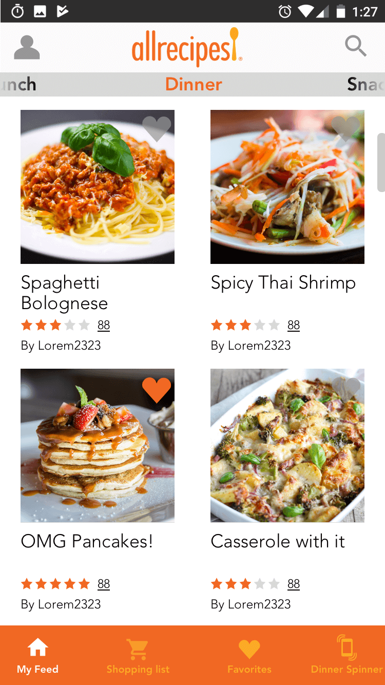
The AllRecipes app currently uses a hamburger menu for navigation, but it's not an optimal pattern, and in some cases, it can actually drastically cut engagement time. The Material Design guidelines include specs for a bottom navigation bar, similar to iOS's tab bar. This not only makes navigation choices more obvious, but gives you a place to put notifications as well. You can only put so many navigation items in the bottom nav, so, using the user research we'd already done, I determined which items were the most important, and prioritized those, retaining the hamburger menu for lower priority sections of the app.
Viewpager
I also aded a viewpager to the main feed with categories, to contextualize recipes, so users would have a better idea of what they were looking at.
User Testing
User test went okay. The app was a bit more navigable, and people found the recipe detail page more useful, but the results of user test still weren't up to what we wanted them to be. The shopping list, though improved, was still confusing, and hands-free mode still wasn't as well received as we'd like.
Bottom Nav Badge
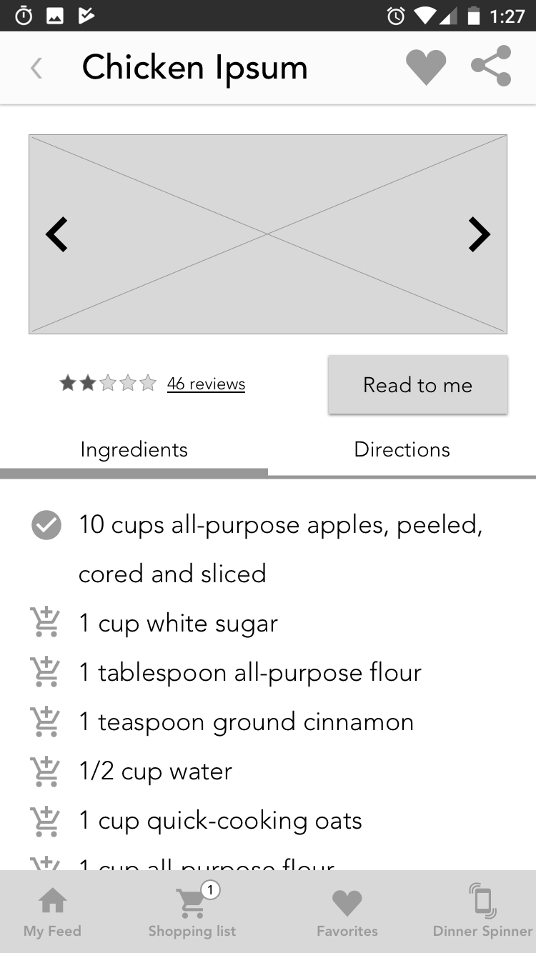
As I said earlier, the bottom navigation serves two purposes: navigation, and a place to put notifications. I added a notification badge to the shopping list tab that incremented whenever people added an item to the list, and changed the icon to a standard Material Design "add to cart" icon. With these changes, users immediately understood what the app was doing and were able to use the shopping list feature easily.
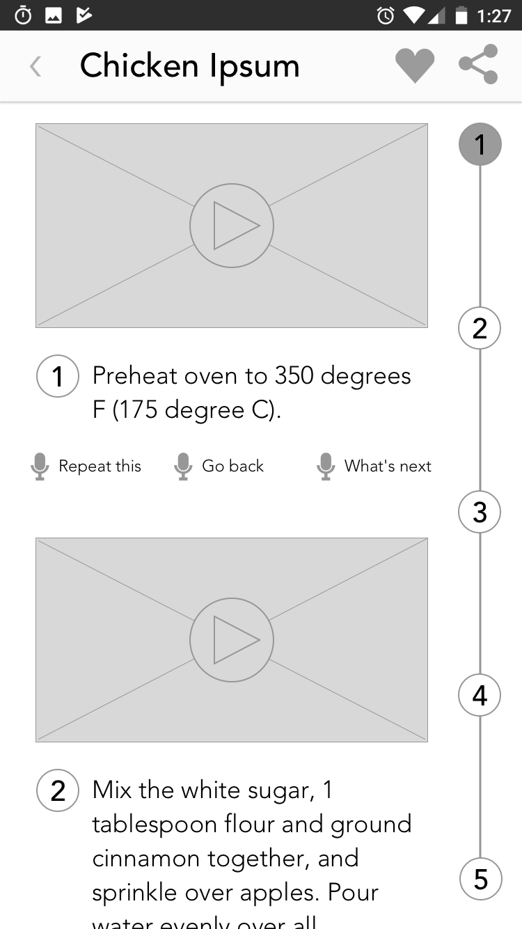
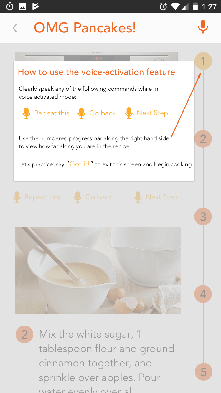
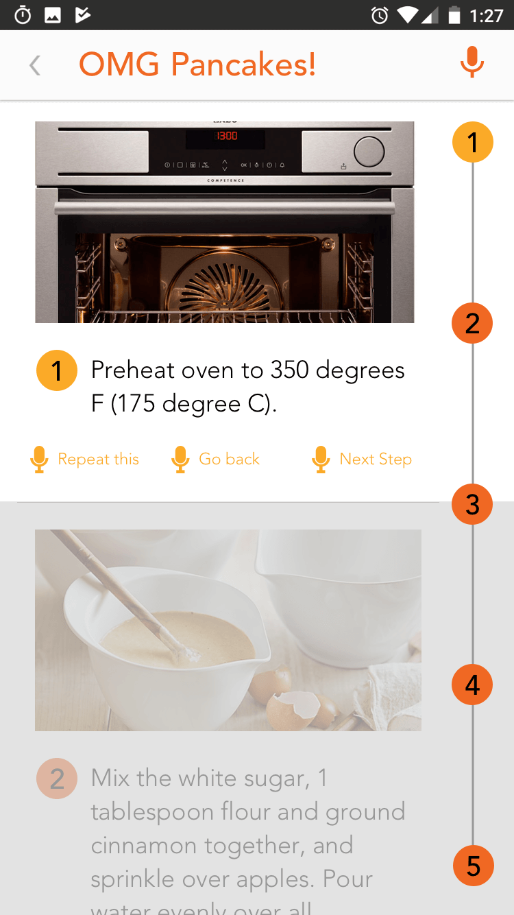
Hands-Free Mode
During a collaborative design studio exercise, we also came up with the idea of adding videos to each step of the cooking process, so I drastically revamped the hands-free mode. Walter Burke Barbe has proposed that people have three distinct learning styles, auditory, visual, and kinesthetic. Having printed instructions, using Androids built-in voice to speech capabilities to read instructions aloud, and the added video demonstrations can cover a diversity of learning styles.
High Fidelity wireframes
Finally, it was time to produce high-fidelity comps. I used the existing app's colors and fonts to create accurate representations of what a redesigned app would look like. If we had more time, I would have been able to add redlines and annotations to indicate hex values for colors, margins and padding, fonts, and font sizes so developers could turn my designs into a working app.
I also added an instructional modal on the first time you visit the hands-free page of a recipe detail. After the project was complete, I revisited the hands-free mode and did some user testing of my own, and found that users were easily able to understand how to use voice commands to go forward and backwards through instructions.

Summary
The night before the presentation, I did some googling, and found out that Alexa already has an Allrecipes skill that talks you through a recipe, but that it's rated 2.5 stars, which is actually really bad. One of the comments that I got when user testing our hands-free mode was that being able to read the direcions on-screen was really helpful. I'm guessing that since Alexa has no visual feedback, users whose learning style doesn't favor spoken directions aren't accounted for, which leaves many users in the dust. By helping the user to solve their problems in the way they want to, you can increase the number of people using your app, and increase your brand's goodwill.
Final presentation (Google Slides)Contact
- me@joshsera.com
- linkedin.com/in/joshsera
- ©2017 Joshua Sera, Seattle, WA